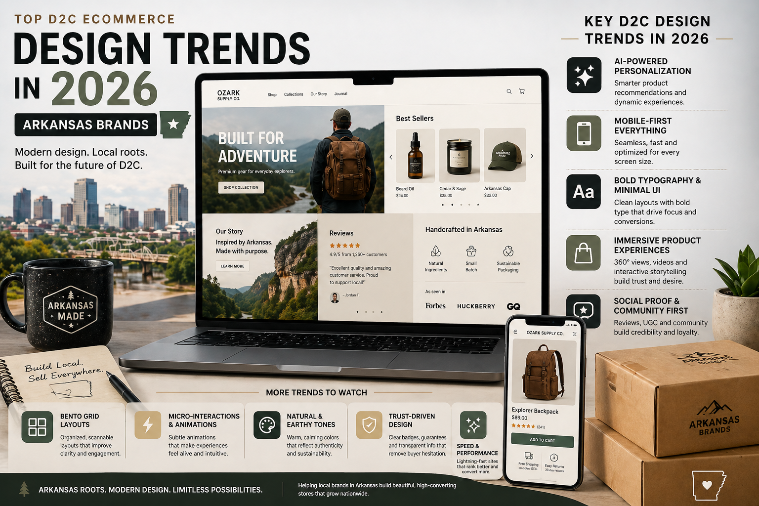
D2C Ecommerce Design 2026: What Brands Need to Shine Online This Year
You built your product. You know it’s good. But when potential customers land on your website, they bounce in seconds and you never hear from them again.
That’s the brutal reality for a lot of D2C (direct-to-consumer) brands right now. The ecommerce market is bigger than ever heading into 2026, and ecommerce design 2026 is make-or-break for brands that sell directly online. Whether you’re running a skincare line from your garage or a specialty food brand out of Little Rock, Arkansas, the brands that invest in smart website design are the ones pulling ahead while everyone else watches from the sidelines.
This article breaks down exactly what D2C ecommerce brands need to do with their websites in 2026 to attract more customers, build trust fast, and turn clicks into real sales. No tech-speak. No fluff. Just practical design decisions that move the needle for small brands competing in a big market.
Let’s get into it.
Why D2C Ecommerce Design Matters More Than Ever in 2026
Here’s something most business owners don’t realize: your website is doing your selling for you or it’s not. There’s no in-between.
In the D2C model, you’re cutting out the middleman. No retailer. No distributor. Just you and the customer. That means your website has to do the job a store associate, a shelf display, and a brand ambassador would all do at once, around the clock, for every visitor.
Current stat on D2C ecommerce growth in the US 2024-2026
The brands that will win in 2026 aren’t just selling good products. They’re telling a clear story, making checkout painless, and giving customers every reason to trust them before they’ve ever met. That starts with design.
For small brands including ones right here in Arkansas that I’ve worked with getting this right doesn’t require a million-dollar budget. It requires making smart, intentional design choices. Here’s what those look like.
1. Your Homepage Has 7 Seconds to Make the Sale
When someone lands on your ecommerce site, they decide almost instantly whether to stay or leave. Researchers have found that users form an opinion about a website in under a second. Seven seconds is generous.
That means your homepage especially the part visible before anyone scrolls needs to do three things immediately:
- Tell them exactly what you sell
- Show them why your brand is different
- Give them a clear path to buy
A lot of D2C brands get this wrong by leading with vague brand language like “Inspired by nature. Built for you.” That sounds nice, but it doesn’t tell a first-time visitor anything useful.
What works instead: A clear headline that names your product and your key benefit. A high-quality product photo. One obvious button that says “Shop Now” or “Get Yours.”
I had a done a consultation with a brand in clothing – Named “ThirdLove” after experimenting with homepage and category and hero product placement to achieve 3% CTA’s .
Think of it like a storefront window. A Little Rock boutique owner wouldn’t put a cryptic art installation in the window they’d put their best-selling item right there, front and center, with a price tag. Your homepage should do the same thing.
Takeaway: Audit the first screen of your website right now. Can someone who’s never heard of you understand what you sell in under five seconds? If not, that’s your first fix.
2. Mobile-First Design Isn't Optional Anymore
Here’s a number that should stop you in your tracks: more than 70% of online shopping in the US now happens on smartphones.
That means if your ecommerce site isn’t built with mobile users as the primary audience, you’re designing for the minority. A site that looks beautiful on a desktop but is awkward or slow on a phone will cost you sales every single day.
Mobile-first ecommerce design in 2026 means:
- Buttons big enough to tap with a thumb (not a mouse cursor)
- Images that load fast even on slower cell connections
- Text you can read without pinching and zooming
- A checkout process that works smoothly on a small screen
In my experience first point of introduction is mobile always and however it converts, as first time people here about the brand / services is from google search or day to day social Activities.
I see this mistake constantly with Arkansas small brands: the business owner designs or approves their website on a laptop, it looks great, and then nobody checks the phone experience. Their customers who are mostly on phones see a broken, slow, frustrating version of the same site.
Takeaway: Pull out your phone right now and visit your own website. Is it easy to browse? Easy to buy? If you’re wincing, your customers are leaving.
3. Brand Trust Signals: The Visual Cues That Make People Buy
One of the biggest differences between a D2C brand website that converts and one that doesn’t comes down to trust. Customers who’ve never heard of you need a reason to hand over their credit card.
In 2026, design itself sends trust signals. Here’s what that means in plain terms:
What builds trust visually:
- Professional product photography (not blurry, not stock photos of random people)
- Real customer reviews displayed prominently not buried on a separate page
- Clear, easy-to-find information: return policy, shipping times, contact info
- An “About” page that shows the real people behind the brand
- Secure checkout indicators (the little padlock icon, SSL certificate)
What kills trust instantly:
- Spelling errors or broken links anywhere on the site
- Stock photos that look generic and fake
- No contact information in sight
- Prices that are hard to find or confusing
- A checkout process that asks for too much information
Imagine you run a specialty food brand in Little Rock, Arkansas, and you’re competing with national names people already recognize. Your design has to work twice as hard to build the trust those big brands get for free from name recognition alone. The good news: a well-designed site can absolutely do that.
Takeaway: Ask someone who doesn’t know your brand to visit your site and tell you when they feel comfortable enough to buy something. Their hesitation points will tell you exactly where your trust signals are missing.
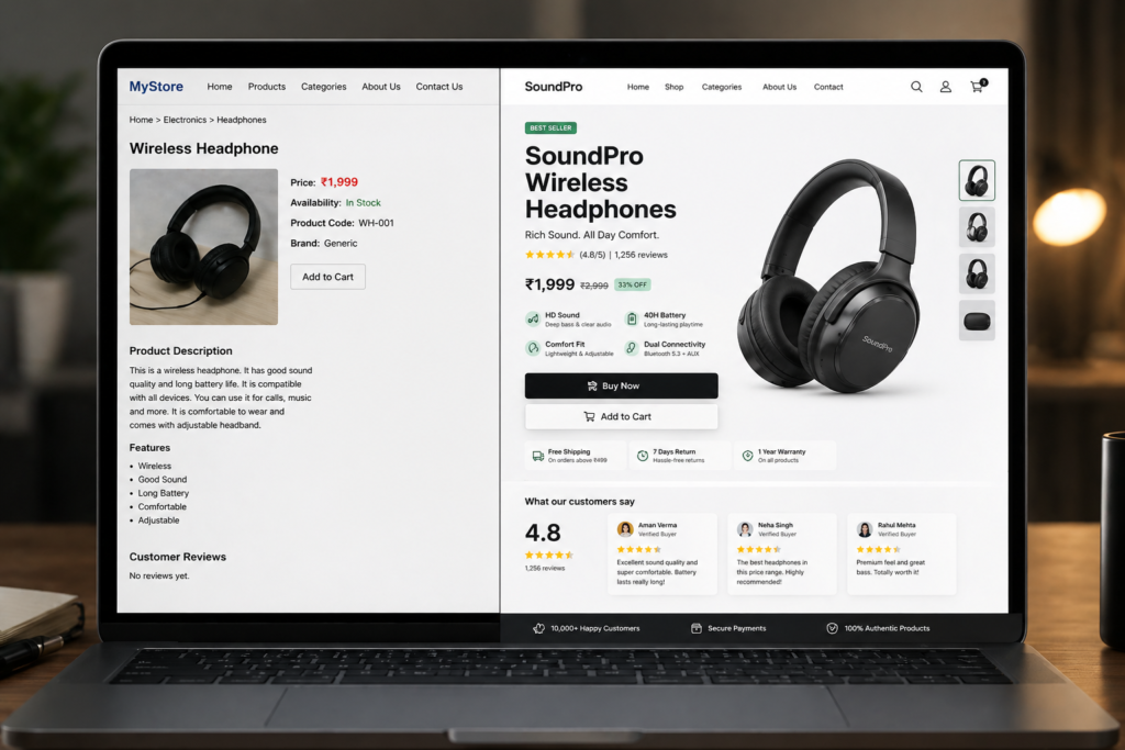
4. Product Pages That Do the Heavy Lifting
Your product page is where a visitor either becomes a customer—or doesn’t. This is the most important real estate on your entire ecommerce site, and most D2C brands underinvest in it.
A high-converting product page in 2026 includes:
High-Quality Images From Multiple Angles
Customers can’t pick up your product. They can’t feel it, smell it, or try it on. Your photos have to do all of that for them. Show your product from multiple angles, in use, and ideally on a real person or in a real setting. Video clips even short ones perform exceptionally well.
Clear, Benefit-Focused Product Descriptions
Don’t just list features. Tell customers what the product does for them. “Made from 100% merino wool” is a feature. “Stays warm in 20-degree weather and machine-washable” is a benefit. Lead with benefits.
Social Proof Right on the Page
Reviews, ratings, and user-generated photos (real customers using your product) should be visible without scrolling far. If you have 200 reviews averaging 4.8 stars, that’s one of your most powerful selling tools don’t hide it at the bottom.
A Clear, Friction-Free Add to Cart
Your “Add to Cart” button should be impossible to miss. No hunting. No confusion. One click and they’re on their way to checkout.
A brand I worked with a handmade goods seller operating out of central Arkansash had a product page that was essentially just a photo and a price. After rebuilding it with multiple images, a benefit-focused description, and customer reviews pulled front and center, their conversion rate improved significantly within the first month.
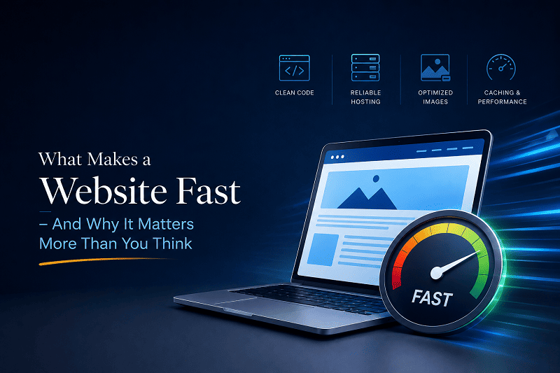
5. Site Speed Is a Sales Tool
delay in page load time, conversion rates drop by around 7%.
That’s not a small number. If your site loads in 5 seconds instead of 2, you’re potentially giving up a significant chunk of the sales you should be making.
For ecommerce design in 2026, speed is a design decision. It affects:
- Whether Google ranks your site in search results (faster sites rank higher)
- Whether customers stay on your page or hit the back button
- Whether checkout completes smoothly or times out and loses the sale
Common speed killers on D2C ecommerce sites:
- Images that haven’t been compressed (huge file sizes slow everything down)
- Too many apps or plugins running in the background
- A cheap hosting plan that can’t handle traffic spikes
What you can do right now: Go to Google PageSpeed Insights and type in your website URL. Google will score your site and tell you exactly what’s slowing it down. If your mobile score is below 70, this should be a priority.
Takeaway: A fast site isn’t a luxury it’s a basic requirement for competing in ecommerce in 2026. If your site is slow, you’re losing customers to competitors who have faster sites, even if your product is better.
6. The Checkout Experience: Where Sales Are Won or Lost
You can have a perfect homepage, beautiful product pages, and strong trust signals and still lose the sale at checkout. Cart abandonment is one of the most frustrating realities of ecommerce, and poor checkout design is one of the biggest causes.
Current cart abandonment rate statistic
In 2026, D2C brands that want to compete need a checkout process that is:
Short. Fewer steps, fewer form fields, faster path to payment confirmation. Do you really need their phone number, date of birth, and job title? Probably not.
Trustworthy. Show security badges, accepted payment icons, and your return policy link right there on the checkout page. Remind them it’s safe to buy from you.
Flexible. Offer multiple payment options credit card, PayPal, Apple Pay, Buy Now Pay Later (like Afterpay or Klarna). Each option you add removes a reason for someone not to buy.
Guest-friendly. Don’t force account creation before purchase. Let people buy as a guest. You can invite them to create an account after.
In my experience Shopify has done a very good job to keep the lowest cart abandoned rate.
A Conway, Arkansas, brand owner I consulted with had no idea their checkout was requiring account creation before purchase a setting that had been turned on by accident during setup. Fixing that one thing alone made a measurable difference in completed orders that same week.
Takeaway: Walk through your own checkout right now as if you were a first-time customer. Count every step. Look for every form field. Every unnecessary click is a reason for someone to bail.
7. SEO and Content: Getting Found Before They Ever Land on Your Site
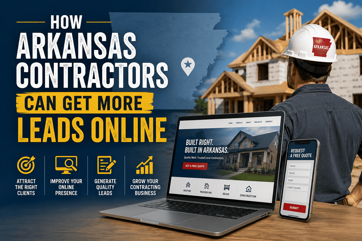
Great ecommerce design gets visitors to buy but you also need to get them there in the first place. That’s where strong SEO, fast performance, and strategic local visibility matter. Our Web Design Arkansas services help businesses across Arkansas build websites that not only look great, but also rank higher and convert more visitors into customers.
Search engine optimization getting your site to show up when people search Google works hand-in-hand with ecommerce design. In 2026, Google rewards sites that are:
- Fast (covered above)
- Mobile-friendly (covered above)
- Structured clearly with proper headings and product descriptions
- Connected to a Google Business Profile (even for online-only brands)
For D2C brands, content also plays a role. A simple blog or “How to Use” guide section on your site gives Google more reasons to send people your way, and gives potential customers more reasons to trust you as an expert in your space.
You don’t need to become a content machine. Start with the basics: clear product descriptions written for real people (not just keyword lists), an FAQ section that answers common buyer questions, and a well-filled-out About page.
Takeaway: If your ecommerce site has no blog, no FAQs, and product descriptions that are one sentence long, you’re invisible to Google. A few small content investments can change that.
Getting Your D2C Ecommerce Site Built Right in 2026
Ecommerce design in 2026 is about one thing: making it easy for people to trust you, understand your product, and buy without friction.
The brands that will shine this year aren’t the ones with the biggest budgets. They’re the ones that nail the fundamentals clear homepages, fast mobile sites, strong product pages, easy checkout, and enough trust signals to make first-time buyers feel safe.
Here’s what to do next:
- Audit your site with fresh eyes (or ask someone who doesn’t know your brand)
- Run a speed test at Google PageSpeed Insights
- Walk through your checkout as a first-time buyer and count every click
- Check your mobile experience on your actual phone, not a desktop simulator
- Identify your weakest point and start there you don’t have to fix everything at once
Want to see what’s possible? Browse websites I’ve built for US brands, including Arkansas businesses, at our-work portfolio page. Real examples from brands just like yours.
Ready to build a site that actually sells? I design ecommerce websites for D2C brands across the US including right here in Arkansas. No jargon. No surprise fees. Just a professional online store built to grow your sales. Want to Start Project just Get a Free Quote.
With transparent pricing ($500–$10,000 depending on your needs) and 10 years of experience building sites for real business owners, I’ll help you get an ecommerce site that works as hard as you do.
FAQ SECTION
How much does it cost to build a D2C ecommerce website in 2026?
For most D2C brand owners, a professionally designed ecommerce site ranges from $1,500 to $10,000 depending on what you need. A straightforward online store with up to 50 products, clean branding, and a smooth checkout typically runs $1,500–$3,500. If you need custom features, subscription options, or complex integrations, expect $5,000–$10,000. I provide a clear, itemized quote upfront no hidden fees and no surprises. The investment usually pays for itself within a few months through increased online sales. [Link to inquiry page for a specific quote]
How long does it take to build an ecommerce website?
A well-built ecommerce site typically takes 4–8 weeks from start to launch, depending on complexity and how quickly you can provide your product photos, copy, and branding assets. I’ve done simpler stores in 2–3 weeks when clients are organized and ready to go. Custom designs with a lot of products or advanced features can take up to 10–12 weeks. I’ll give you a realistic timeline upfront so you can plan your launch accordingly.
Can't I just use Shopify or Squarespace myself and save money?
You can, and for very early-stage brands on a tight budget, a DIY platform is a reasonable starting point. But there are real trade-offs: templates are generic, customization is limited, and most DIY stores struggle with the specific design and trust-building elements that convert first-time visitors into buyers. When you’re ready to grow and compete seriously, a professionally designed site built specifically for your brand gives you a significant edge. Many of my clients started on Squarespace and came to me when they hit the ceiling of what DIY could do.
Do I need someone to maintain my ecommerce website after it's built?
Yes and this is something a lot of people don’t plan for. Your ecommerce site needs regular updates: security patches, plugin updates, product additions, and occasional design tweaks. I include one year of hosting and maintenance support with every site I build, so you’re not left on your own after launch. After that first year, I offer affordable ongoing support packages. You’ll never be stuck wondering who to call when something breaks.
Will a new ecommerce website actually bring me more customers?
A better website alone won’t magically bring traffic—that takes SEO, marketing, or paid ads over time. What a well-designed ecommerce site will do is convert more of the visitors you already have into paying customers. If you’re currently getting traffic but not enough sales, the website is often the problem. I’ve seen D2C brands double their conversion rates simply by fixing the design, speed, and checkout experience of a site that was already getting traffic.
What do you need from me to build my ecommerce website?
The main things I need from you are: your product photos (or a plan to get them taken), your brand assets (logo, colors, any existing brand guidelines), your product information and pricing, and your preferred payment setup. I handle the design, development, and technical setup. Most clients are surprised by how little heavy lifting they actually have to do I guide you through every step and ask the right questions so we don’t have to backtrack later.
Do you only work with Arkansas businesses, or can you help brands anywhere in the US?
I work with D2C brands all across the United States. While I’m based in Arkansas and love helping local businesses from Little Rock to Conway to Benton—most of my ecommerce work is done remotely, and distance has never been an issue. If you’re a US brand owner looking to improve your online store, I’d love to talk.